
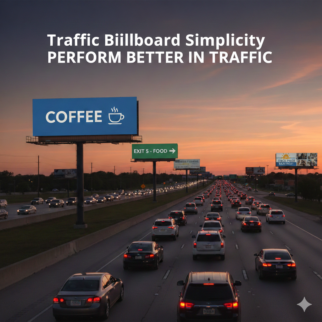
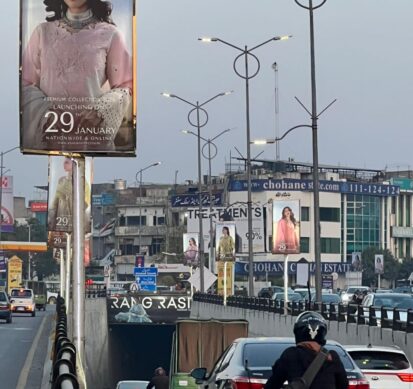
Billboards compete with chaos. Lahore traffic is loud, crowded, and unpredictable. Cars, bikes, buses, rickshaws, pedestrians, signals, horns, and roadside shops all fight for attention at the same time. In this environment, complex billboard ads do not stand a chance. Simple billboard ads perform better because they match how the human brain processes information while moving.
Attention in traffic is limited
Drivers and riders are not sitting comfortably with time to analyze details. Their primary focus is the road. Safety comes first. That means a billboard only gets a quick glance, often three to five seconds at most.
When a design is overloaded with text, multiple images, and small fonts, it becomes impossible to process in that short window. The brain skips it. A simple ad with one strong visual and a short message gets absorbed instantly.
In busy Lahore routes like Jail Road or Ferozepur Road, vehicles stop and move constantly. Even when traffic slows down, distractions increase. Street vendors, signals changing, and side movement reduce concentration. Simple messages survive in this environment because they require less effort.
The brain prefers clarity
Human brains look for patterns and clarity. When information is clean and structured, it feels comfortable. When it looks crowded, the brain treats it as noise.
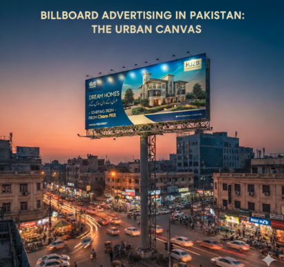
A billboard with a bold headline, high contrast colors, and one focal point becomes easy to read. Eyes lock onto it naturally. The viewer does not struggle to understand what is being offered.
Simple designs reduce cognitive load. That means the brain does not need to work hard to decode the message. Less effort leads to better recall.
Speed changes everything
Traffic speed directly affects billboard effectiveness. On fast moving roads, reading time drops dramatically. If a car passes a billboard in two seconds, only the biggest and clearest elements will register.
Small fonts, long sentences, detailed descriptions, and multiple phone numbers get ignored. A short phrase, strong brand name, and memorable visual stay behind in memory.
Even on slower roads, attention is fragmented. Drivers check mirrors. Riders balance. Passengers scroll on phones. Simplicity ensures that even a half glance leaves an impression.
One message works better than many
Businesses often try to fit every service into one billboard. They list products, prices, offers, contact details, and social media handles. That approach weakens the impact.
A billboard should communicate one idea. Just one. It might be brand awareness. It might be a single offer. It might be a new launch. Trying to say everything results in saying nothing clearly.
When the viewer understands the message instantly, the ad succeeds. When confusion appears, the opportunity is lost.
Visual hierarchy matters
Simple billboard ads use clear visual hierarchy. That means the most important element stands out first. The second most important comes next. Everything else supports those two.
Large font for the main line. Smaller but readable text for support. Strong brand logo placed strategically. Clean background. That structure guides the eye naturally.
In traffic, viewers do not consciously analyze design. Their eyes move automatically toward the most dominant element. Simple layouts guide that movement without resistance.
Repetition builds familiarity
Billboards work through repetition. People pass the same routes daily. They see the same ad again and again. Simple ads are easier to remember over repeated exposure.
If the message is short and consistent, it becomes familiar quickly. Familiar brands feel safer. Safe choices often win during purchase decisions.
Complex ads do not benefit as much from repetition because viewers cannot recall the full message. They might remember colors but forget details. Simplicity improves retention.
Emotional impact increases with clarity
A clean visual paired with a powerful image can trigger emotion instantly. That emotional connection is stronger than informational overload.
For example, a beautiful interior image placed on a billboard does not need a paragraph explaining quality. The viewer imagines their own home looking similar. That feeling sticks.
Simple designs leave space for imagination. Crowded designs leave no room to think.
Trust perception improves
In Pakistan, billboard presence already signals credibility. When the design also looks clean and confident, trust increases further.
Overdesigned ads often appear desperate. Too many claims reduce believability. A simple, confident message feels strong.
In Lahore’s competitive market, brands that communicate clearly stand out more than those trying too hard.
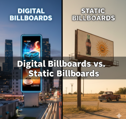
Cost efficiency improves
From a practical perspective, simple billboard ads are easier to update and reproduce. Clean designs scale better across multiple locations.
Digital billboards especially benefit from simplicity. Since ads rotate every few seconds, viewers may only catch part of the display. Clear visuals and minimal text ensure the message lands even during brief exposure.
Simplicity supports digital search behavior
Modern customers often search online after seeing an ad. If they remember the brand name clearly, they can look it up later.
A cluttered billboard makes brand recall harder. A simple design with a strong name and visual identity increases the chance that someone types it into Google at night.
Outdoor advertising does not end on the road. It continues when the customer decides to explore further.
What businesses should focus on
To perform well in traffic, billboard ads should follow a few core principles:
Keep the headline short and bold.
Use high contrast color combinations.
Limit text to essential words only.
Highlight the brand name clearly.
Avoid small details that require close reading.
Place the billboard where vehicles naturally slow down.
These principles may sound basic, but they directly match human behavior in traffic conditions.
Final perspective
Simple billboard ads perform better in traffic because they respect reality. Roads are busy. Attention is short. People are distracted. The message must fit that environment.
In a city like Lahore, where daily routes are repetitive and traffic density is high, clarity beats complexity every time. Brands that understand this gain stronger recall, better trust, and higher long-term impact.
This is especially true for visually driven businesses. When a brand communicates through clean, attractive visuals rather than crowded text, it allows the audience to connect instantly. Over time, that consistent presence builds recognition and preference.
For companies focused on aesthetics and space transformation, a simple billboard showcasing thoughtful design can speak louder than a long explanation. Sometimes one clear image placed in the right location does more work than a full page of information.
Outdoor Advertising,
No Comment Yet! You can post first response comment.